


Title
Masimo
Category
Branding
Brief
Masimo is a manufacturer of noninvasive patient monitoring technologies based in Irvine, California. Although their product is top of the line in the medical field, their visual identity blends with their competitors and does not stand out. In my own personal experience at hospitals, I felt very disconnected from the environment that surrounded me. I did not understand what kind of situation I was in and had to just trust what the nurses and doctors were doing. Through this rebrand, Masimo will focus on a more inviting visual identity so that the users will be more at ease at the hospitals and can fully understand their personal situations.
The Mark
The logotype was created using a custom grid that consists of both squares and circles. The results with two opposite shapes made the logotype be both fluid and sturdy that fit the new brand of Masimo of being a brand that is both reliable and inviting.


Pattern
Using the same grid that was used for the logotype, a custom pattern was made that is used for different graphical elements throughout the visual brand.

Icons
With the custom grid, icons were also made that gives more life to Masimo's devices. Through these enjoyable icons, the brand is much more approachable to users.
Deliverables

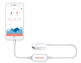
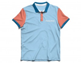
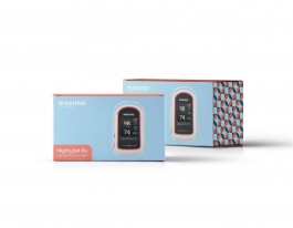
Screen-Based Media
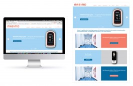
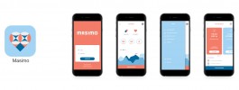
Posters
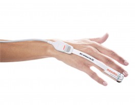
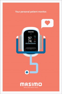
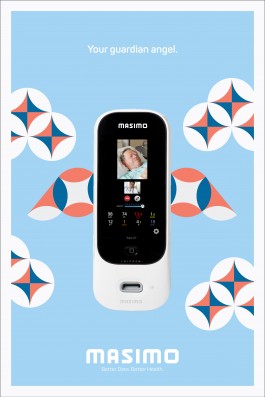
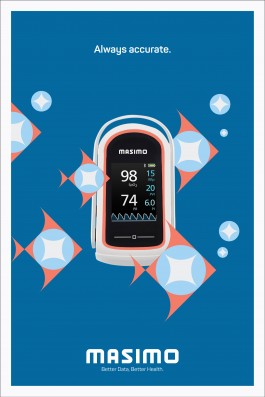
This set of posters advertises three of Masimo's most personal devices the company has on the market (Radius-7, Rad 97, and MightySat Rx). Each of these devices have their own unique functions. Using the icons as illustrations, the posters highlight the special characteristics of the devices in an inviting way.
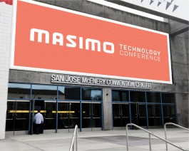
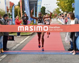
Sponsored Events


Title
Masimo
Category
Identity System, Print
Brief
Masimo is a manufacturer of noninvasive patient monitoring technologies based in Irvine, California. Although their product is top of the line in the medical field, their visual identity blends with their competitors and does not stand out. In my own personal experience at hospitals, I felt very disconnected from the environment that surrounded me. I did not understand what kind of situation I was in and had to just trust what the nurses and doctors were doing. Through this rebrand, Masimo will focus on a more inviting visual identity so that the users will be more at ease at the hospitals and can fully understand their personal situations.
The Mark
The logotype was created using a custom grid that consists of both squares and circles. The results with two opposite shapes made the logotype be both fluid and sturdy that fit the new brand of Masimo of being a brand that is both reliable and inviting.


Pattern
Using the same grid that was used for the logotype, a custom pattern was made that is used for different graphical elements throughout the visual brand.

Icons
With the custom grid, icons were also made that gives more life to Masimo's devices. Through these enjoyable icons, the brand is much more approachable to users.
Deliverables


Screen-Based Media


Posters
This set of posters advertises three of Masimo's most personal devices the company has on the market (Radius-7, Rad 97, and MightySat Rx). Each of these devices have their own unique functions. Using the icons as illustrations, the posters highlight the special characteristics of the devices in an inviting way.


Sponsored Events
